Gmail or Google Mail has always been working on easing out the functionality and usability of its applications. Many new things have been added for users so far. But its nothing like what Google is planning to do with web and mobile applications, if the leaked pictures are to be believed. Google is looking forward to adding a whole new user interface to the Gmail application, and along with that Gmail will now offer automatic mail sorting.

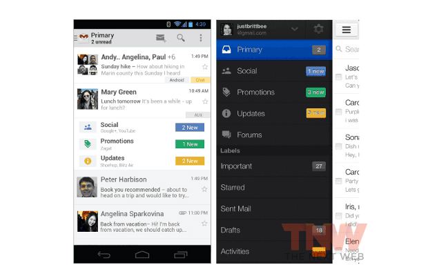
The user interface takes a cue from the Google Plus interface and tries to incorporate newer colors that Google has been adding to most apps. The mail feed would no longer be in terms of a boring line of text from the subject; but instead a snippet of the mail itself, including user pictures will be available. The inbox is likely to be segregated by four different labels including social, updates, promotions and the primary inbox itself.

Under the Social tab, all messages relating to social media will automatically be moved to this category and will be accessible by users. Following that all promotional emails relating to shopping, sales and purchase will automatically go under offers and updates, and will take care of all important notifications that users get through many of its services, such as credit card payments, mobile bill payments and so on.
The update sounds interesting while it will offer more functionality and ease of access to users, but it again depends on how well everything is implemented, and in the coming times we will get to see if the product will be a hit or something like Orkut that became like just another social networking service.
No comments:
Post a Comment